Data, Variability, and Statistical Questions
This week, your student will work with data and use data to answer statistical questions. Questions such as “Which band is the most popular among students in sixth grade?” or “What is the most common number of siblings among students in sixth grade?” are statistical questions. They can be answered using data, and the data are expected to vary (i.e. the students do not all have the same musical preference or the same number of siblings).
Students have used bar graphs and line plots, or dot plots, to display and interpret data. Now they learn to use histograms to make sense of numerical data. The following dot plot and histogram display the distribution of the weights of 30 dogs.

A dot plot shows individual data values as points. In a histogram, the data values are grouped. Each group is represented as a vertical bar. The height of the bar shows how many values are in that group. The tallest bar in this histogram shows that there are 10 dogs that weigh between 20 and 25 kilograms.
The shape of a histogram can tell us about how the data are distributed. For example, we can see that more than half of the dogs weigh less than 25 kilograms, and that a dog weighing between 25 and 30 kilograms is not typical.
Here is a task to try with your student:
This histogram shows the weights of 143 bears.
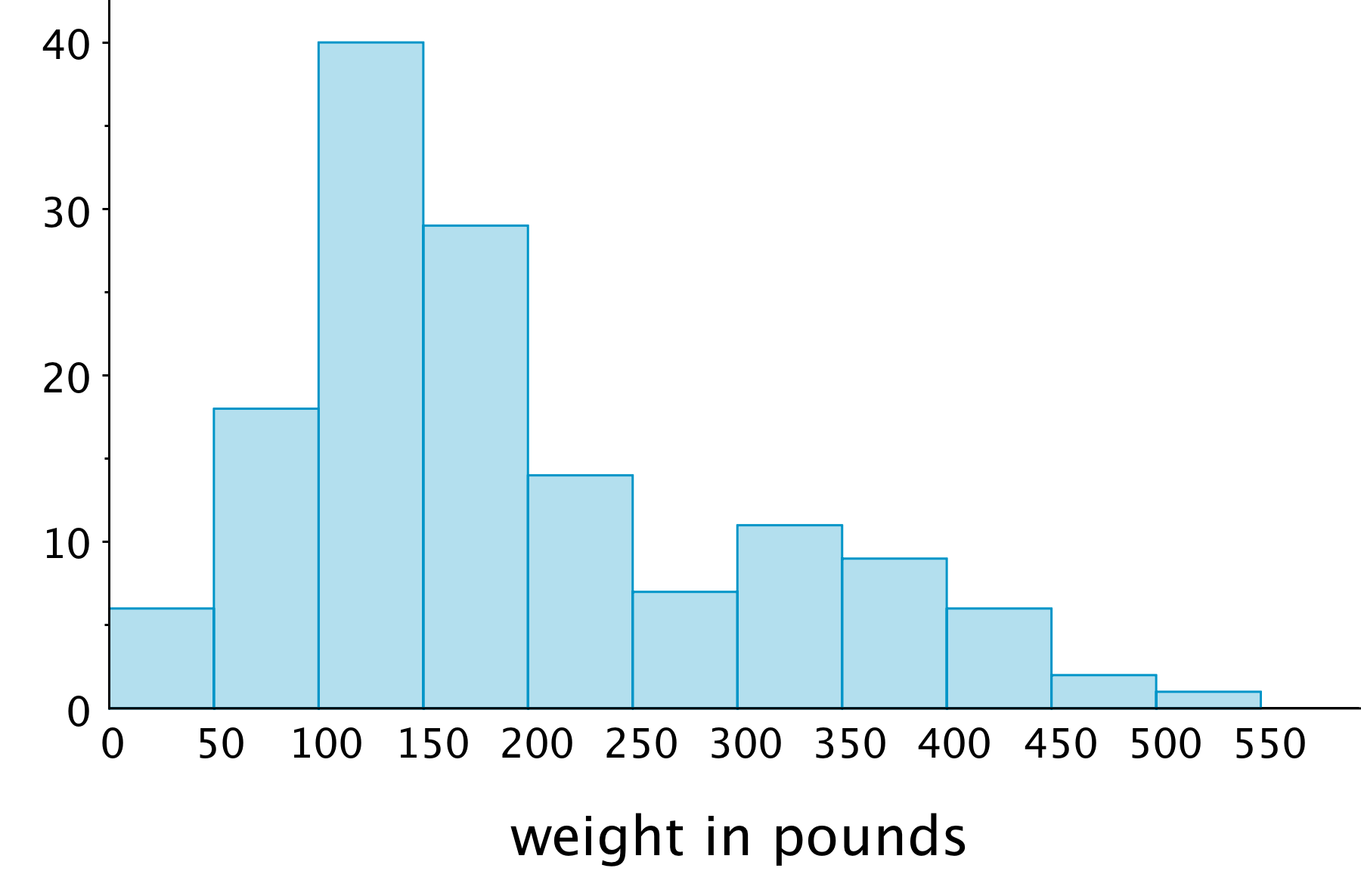
About how many bears weigh between 100 and 150 pounds?
About how many bears weigh less than 100 pounds?
- Noah says that because almost all the bears weigh between 0 and 500 pounds, we can say that a weight of 250 pounds is typical for the bears in this group. Using the histogram, explain why this is incorrect.
Solution:
- About 40 bears. This is the height of the tallest bar of the histogram.
- About 24 bears. The two leftmost bars represent the bears that weigh less than 100 pounds. Add the heights of these two bars.
- We can visually tell from the histogram that most bears weigh less than 250 pounds: the bars to the left of 250 are taller than those to the right. If we add the heights of bars, fewer than 40 bears weigh more than 250 pounds, while over 100 bears weigh less than 250 pounds, so it is not accurate to say that 250 pounds is a typical weight.
Mean and MAD
This week, your student will learn to calculate and interpret the mean, or the average, of a data set. We can think of the mean of a data set as a fair share—what would happen if the numbers in the data set were distributed evenly. Suppose a runner ran 3, 4, 3, 1, and 5 miles over five days. If the total number of miles she ran, 16 miles, was distributed evenly across five days, the distance run per day, 3.2 miles, would be the mean. To calculate the mean, we can add the data values and then divide the sum by how many there are.
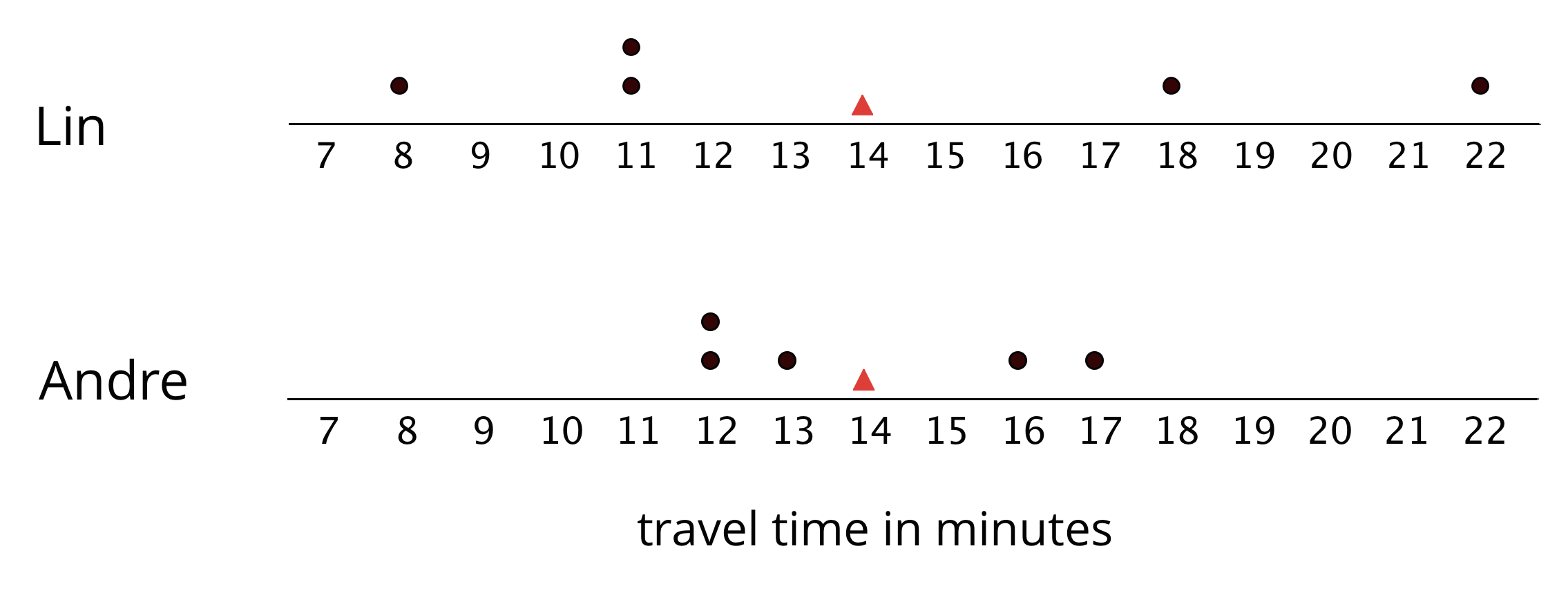
If we think of data points as weights along a number line, the mean can also be interpreted as the balance point of the data. The dots show the travel times, in minutes, of Lin and Andre. The triangles show each mean travel time. Notice that the data points are “balanced” on either side of each triangle.
Your student will also learn to find and interpret the mean absolute deviation or the MAD of data. The MAD tells you the distance, on average. of a data point from the mean. When the data points are close to the mean, the distances between them and the mean are small, so the average distance—the MAD—will also be small. When data points are more spread out, the MAD will be greater.
We use mean and MAD values to help us summarize data. The mean is a way to describe the center of a data set. The MAD is a way to describe how spread out the data set is.
Here is a task to try with your student:
- Use the data on Lin’s and Andre’s dot plots to verify that the mean travel time for each student is 14 minutes.
- Andre says that the mean for his data should be 13 minutes, because there are two numbers to the left of 13 and two to the right. Explain why 13 minutes cannot be the mean.
- Which data set, Lin’s or Andre’s, has a higher MAD (mean absolute deviation)? Explain how you know.
Solution:
For Lin’s data, the mean is
8+11+11+18+225=705 , which equals 14. For Andre’s data, the mean is12+12+13+16+175=705 , which also equals 14.Explanations vary. Sample explanations:
- The mean cannot be 13 minutes because it does not represent a fair share.
- The mean cannot be 13 minutes because the data would be unbalanced. The two data values to the right of 13 (16 and 17) are much further away from the two that are to the left (12 and 12).
Lin’s data has a higher MAD. Explanations vary. Sample explanations:
- In Lin’s data, the points are 6, 3, 3, 4, and 8 units away from the mean of 14. In Andre’s data, the points are 2, 2, 1, 2, and 3 units away from the mean of 14. The average distance of Lin’s data will be higher because those distances are greater.
- The MAD of Lin’s data is 4.8 minutes, and the MAD of Andre’s data is 2 minutes.
- Compared to Andre’s data points, Lin’s data points are farther away from the mean.
Median and IQR
This week, your student will learn to use the median and interquartile rangeor IQR to summarize the distribution of data.
The median is the middle value of a data set whose values are listed in order. To find the median, arrange the data in order from least to greatest, and look at the middle of the list.
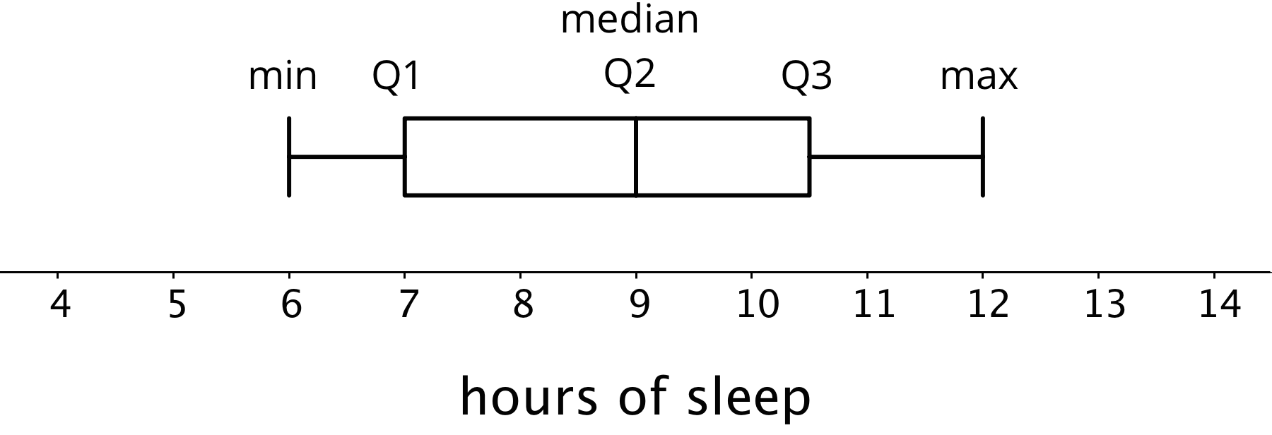
Suppose nine students reported the following numbers of hours of sleep on a weeknight.
| 6 | 7 | 7 | 8 | 9 | 9 | 10 | 11 | 12 |
|---|
The middle number in 9, so the median number of hours of sleep is 9 hours. This means that half of the students slept for less than or equal to 9 hours, and the other half slept for greater than or equal to 9 hours.
Suppose eight teachers reported these numbers of hours of sleep on a weeknight.
| 5 | 6 | 6 | 6 | 7 | 7 | 7 | 8 |
|---|
This data set has an even number of values, so there are two numbers in the middle—6 and 7. The median is the number exactly in between them: 6.5. In other words, if there are two numbers in the middle of a data set, the median is the average of those two numbers.
The median marks the 50th percentile of sorted data. It breaks a data set into two halves. Each half can be further broken down into two parts so that we can see the 25th and 75th percentiles. The 25th, 50th, and 75th percentiles are called the first, second, and third quartiles (or Q1, Q2, and Q3).
A box plot is a way to represent the three quartiles of a data set, along with its maximum and minimum. This box plot shows those five numbers for the data on the students’ hours of sleep.
The distance between the first and third quartiles is the interquartile range or the IQR of data. It tells us about the middle half of the data and is represented by the “width” of the box of the box plot. We can use it to describe how alike or different the data values are. Box plots are especially useful for comparing the distributions of two or more data sets.
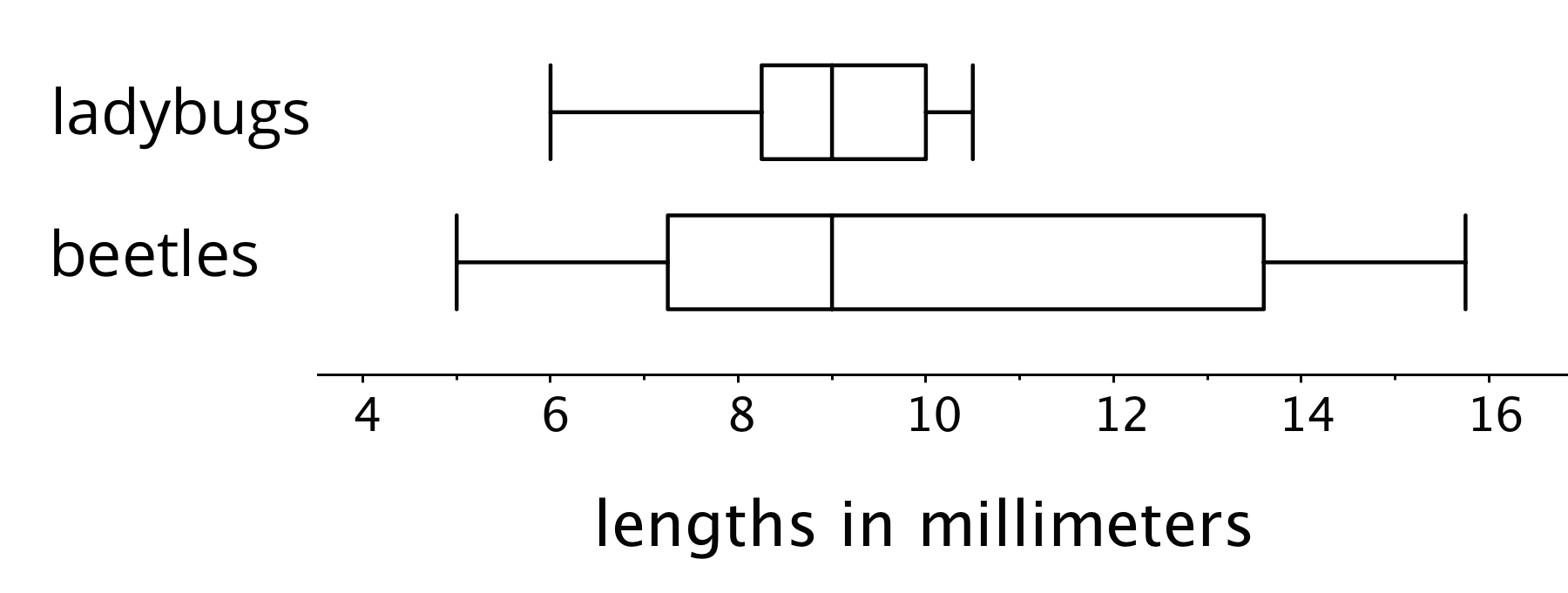
The box plots show that the smallest measured beetle is 5 millimeters long, and that half of the beetles are between approximately 7 and 14 millimeters long.
Here is a task to try with your student:
- Look at the box plots for the ladybugs and beetles.
- Which group has a greater IQR: ladybugs or beetles? Explain how you know.
- Which group shows more variation in lengths: ladybugs or beetles? Explain how you know.
- Here is a table showing the number of points Jada scored in 10 basketball games.
10 14 6 12 38 12 8 7 10 23 What is her median score?
Solution:
- Beetles have a greater IQR. For ladybugs, the IQR (the distance from the first quartile to the third quartile) is about 1.7 millimeters. For beetles, the IQR is about 6.3 millimeters.
- Ladybugs are much more alike in their lengths than are beetles. The IQR for ladybugs is a smaller number and the box in the plot is narrower, which mean that their lengths are fairly close to one another.
- 11 points. First, sort the data: 6, 7, 8, 10, 10, 12, 12, 14, 23, 38. Then look at the middle of the list: the numbers 10 and 12 are the fifth and sixth numbers in the list. The median is the average of these numbers:
10+122=11 .
IM 6–8 Math was originally developed by Open Up Resources and authored by Illustrative Mathematics, and is copyright 2017-2019 by Open Up Resources. It is licensed under the Creative Commons Attribution 4.0 International License (CC BY 4.0). OUR's 6–8 Math Curriculum is available at https://openupresources.org/math-curriculum/.